What is a Candlestick Chart? How to Use It in Trading

- Understanding the basics of a candlestick chart
- The anatomy of a candlestick chart
- Interpreting candlestick patterns for trading
- Using candlestick charts to predict market trends
- Strategies for trading with candlestick charts
- Common mistakes to avoid when using candlestick charts in trading
Understanding the basics of a candlestick chart
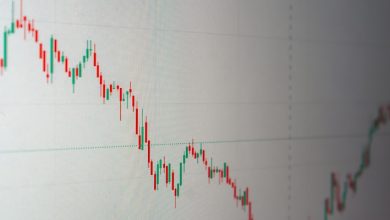
When it comes to trading, understanding the basics of a candlestick chart is essential. A candlestick chart is a type of financial chart used to represent price movements in trading. Each candlestick typically shows the open, high, low, and close prices for a specific time period. By analyzing these candlesticks, traders can gain insights into market trends and make more informed decisions.
Candlestick charts are made up of individual candlesticks that can be either bullish or bearish. A bullish candlestick is typically represented by a white or green body, indicating that the closing price is higher than the opening price. On the other hand, a bearish candlestick is represented by a black or red body, indicating that the closing price is lower than the opening price.
Traders can also look at the wicks or shadows of the candlesticks, which show the price range for the trading period. The top of the upper wick represents the high price, while the bottom of the lower wick represents the low price. By analyzing the length and direction of the wicks, traders can interpret market sentiment and potential price reversals.
The anatomy of a candlestick chart
The anatomy of a candlestick chart consists of several key components that traders use to analyze price movements in the financial markets. Each candlestick represents a specific time period, such as one day, and includes the opening, closing, high, and low prices for that period.
At the top and bottom of each candlestick, you will see thin lines called wicks or shadows. The upper wick represents the high price, while the lower wick represents the low price. The body of the candlestick, which is typically colored either green or red, represents the opening and closing prices.
When a candlestick is green, it means that the closing price was higher than the opening price, indicating a bullish or positive market sentiment. Conversely, a red candlestick shows that the closing price was lower than the opening price, signaling a bearish or negative market sentiment.
Traders can use candlestick charts to identify trends, reversals, and potential entry or exit points for their trades. By analyzing the patterns and formations of candlesticks, traders can gain valuable insights into market dynamics and make more informed trading decisions.
Interpreting candlestick patterns for trading
When it comes to trading, interpreting candlestick patterns can be a valuable tool for making informed decisions. Candlestick charts provide a visual representation of price movements over a specific period, allowing traders to analyze market trends and potential future price movements.
There are various candlestick patterns that traders can use to identify potential entry and exit points in the market. Some of the most common patterns include doji, hammer, shooting star, and engulfing patterns. Each pattern conveys valuable information about market sentiment and can help traders anticipate price movements.
It is important for traders to understand the significance of each candlestick pattern and how to interpret them in the context of the overall market trend. By recognizing these patterns and understanding their implications, traders can make more informed trading decisions and improve their chances of success in the market.
Using candlestick charts to predict market trends
When using candlestick charts to predict market trends, it is essential to look for patterns and formations that can indicate potential price movements. By analyzing the shapes and colors of the candlesticks, traders can gain insights into the psychology of the market participants and make more informed decisions.
One of the most popular candlestick patterns used in technical analysis is the “Doji,” which represents indecision in the market. A Doji candlestick has a small body with wicks on both ends, indicating that neither the bulls nor the bears are in control. Traders often interpret this pattern as a signal of a potential trend reversal or consolidation.
Another important candlestick pattern to watch for is the “Hammer,” which typically occurs at the bottom of a downtrend. The Hammer candlestick has a small body with a long lower wick, suggesting that buyers are starting to step in and push the price higher. This pattern is often seen as a bullish signal that the trend may be about to reverse.
By combining various candlestick patterns and formations, traders can create a more comprehensive analysis of the market and improve their chances of making successful trades. It is essential to remember that candlestick charts are just one tool in a trader’s toolbox and should be used in conjunction with other technical indicators and analysis methods for the best results.
Strategies for trading with candlestick charts
Trading with candlestick charts involves using various strategies to analyze price movements and make informed decisions. One common strategy is to look for specific candlestick patterns that indicate a potential trend reversal or continuation. For example, a “hammer” pattern at the bottom of a downtrend can signal a potential reversal, while a “doji” pattern may suggest indecision in the market.
Another strategy is to pay attention to the size and color of the candles. Large green candles indicate strong buying pressure, while large red candles suggest strong selling pressure. Traders can use this information to gauge the strength of a trend and make decisions accordingly. Additionally, the length of the wicks on a candle can provide valuable information about the volatility of the market.
It is also important to consider the context in which candlestick patterns form. For example, a bullish reversal pattern may be more significant if it occurs near a key support level or after a prolonged downtrend. Traders should always consider the overall market conditions and use other technical indicators to confirm their analysis.
Overall, trading with candlestick charts requires a combination of pattern recognition, candle size analysis, and contextual understanding. By mastering these strategies and incorporating them into a comprehensive trading plan, traders can improve their chances of success in the market.
Common mistakes to avoid when using candlestick charts in trading
When using candlestick charts in trading, it is important to avoid some common mistakes that can affect your decision-making process and ultimately your trading outcomes. Here are some key mistakes to steer clear of:
- Avoid relying solely on candlestick patterns without considering other technical indicators and analysis.
- Avoid trading based on a single candlestick without confirming the signal with additional information.
- Avoid ignoring the overall market context and trend when interpreting candlestick patterns.
- Avoid using candlestick charts with a very short time frame, as they can be more volatile and less reliable.
- Avoid overtrading based on every minor candlestick movement, as this can lead to unnecessary losses.
By being aware of these common mistakes and taking steps to avoid them, you can improve your use of candlestick charts in trading and make more informed decisions.