How to Read Candlestick Charts for Beginners

- Understanding the basics of candlestick charts
- Identifying common candlestick patterns
- Interpreting the significance of candlestick colors
- Using candlestick charts to predict market trends
- Practical tips for reading candlestick charts effectively
- Common mistakes to avoid when analyzing candlestick charts
Understanding the basics of candlestick charts
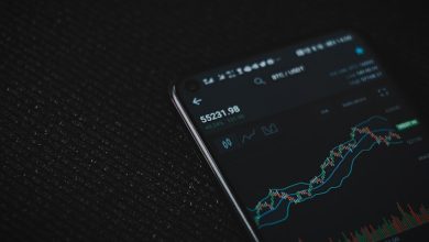
Candlestick charts are a popular tool used by traders to analyze price movements in the financial markets. Understanding the basics of candlestick charts is essential for beginners looking to interpret market trends and make informed trading decisions.
Candlestick charts consist of individual “candles” that represent price movements over a specific time period, such as one hour, one day, or one week. Each candle has a body, which indicates the opening and closing prices, as well as “wicks” or “shadows” that show the high and low prices during that period.
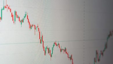
The color of the candle body can vary, with green or white candles typically representing bullish or positive price movements, while red or black candles symbolize bearish or negative price movements. By analyzing the patterns and formations of these candles, traders can gain insights into market sentiment and potential future price movements.
Some common candlestick patterns to look out for include doji, hammer, shooting star, and engulfing patterns. These patterns can signal potential reversals or continuations in price trends, providing valuable information for traders.
In conclusion, mastering the basics of candlestick charts is a crucial step for beginners looking to navigate the complex world of trading. By learning how to interpret these visual representations of price movements, traders can enhance their analytical skills and make more informed decisions in the financial markets.
Identifying common candlestick patterns
- One common candlestick pattern to look for is the “hammer,” which indicates a potential reversal in the market. It is characterized by a small body at the top and a long lower wick.
- Another pattern to watch for is the “doji,” which signals indecision in the market. It has a small body with wicks on both sides, indicating that buyers and sellers are at a standstill.
- The “engulfing” pattern is also significant, as it suggests a reversal in trend. It consists of two candles where the second candle completely “engulfs” the first one, signaling a shift in momentum.
- Traders should pay attention to the “morning star” pattern, which is a bullish reversal pattern that consists of three candles: a long bearish candle, a small bearish or bullish candle, and a long bullish candle.
- Lastly, the “shooting star” pattern is essential to recognize as it indicates a potential reversal. It has a small body at the top with a long upper wick, suggesting that buyers tried to push the price higher but failed.
Interpreting the significance of candlestick colors
When interpreting the significance of candlestick colors on a chart, it is important to understand what each color represents. The color of a candlestick can provide valuable information about the price movement of a particular asset. In general, green candlesticks indicate that the closing price was higher than the opening price, while red candlesticks indicate the opposite – that the closing price was lower than the opening price.
Green candlesticks are often seen as a bullish signal, suggesting that buyers are in control and that the price may continue to rise. On the other hand, red candlesticks are typically viewed as a bearish signal, indicating that sellers are in control and that the price may decline. However, it is important to consider other factors, such as the size of the candlestick and the overall trend of the chart, when interpreting the significance of a particular color.
In addition to green and red candlesticks, some charts may use other colors to represent different price movements. For example, blue candlesticks may indicate that the closing price was the same as the opening price, while black or white candlesticks may be used to represent neutral or indecisive price movements.
Overall, understanding the significance of candlestick colors can help you make more informed decisions when trading or investing in the financial markets. By paying attention to the colors of the candlesticks on a chart, you can gain valuable insights into the price movements of an asset and improve your overall trading strategy.
Using candlestick charts to predict market trends
When it comes to predicting market trends, candlestick charts can be a valuable tool for beginners. These charts provide a visual representation of price movements over a specific period, making it easier to identify patterns and trends. By analyzing the shapes and colors of the candlesticks, traders can gain insights into market sentiment and potential future price movements.
One of the key advantages of using candlestick charts is their ability to show market psychology in action. The patterns formed by the candlesticks can indicate whether buyers or sellers are in control, helping traders make informed decisions about when to enter or exit a trade. By learning how to interpret these patterns, beginners can start to develop their own strategies for predicting market trends.
Some of the most common candlestick patterns to watch out for include doji, hammer, shooting star, and engulfing patterns. Each of these patterns has its own unique characteristics and can signal different potential outcomes in the market. By studying these patterns and practicing with historical data, beginners can start to build their confidence in using candlestick charts to predict market trends.
Practical tips for reading candlestick charts effectively
When it comes to reading candlestick charts effectively, there are some practical tips that can help beginners navigate this analytical tool. Here are some key guidelines to keep in mind:
- Focus on the patterns: Look for common patterns like doji, hammer, and engulfing to interpret market sentiment.
- Pay attention to the wicks: The length of the wicks can indicate the volatility of the market during a specific time period.
- Understand the candlestick colors: Red candles signify a bearish trend, while green candles indicate a bullish trend.
- Use multiple time frames: Analyzing candlestick charts across different time frames can provide a more comprehensive view of market trends.
- Combine with other indicators: Utilize other technical indicators like moving averages or RSI to confirm signals from candlestick patterns.
By following these tips, beginners can start to develop a better understanding of how to read candlestick charts and make more informed trading decisions.
Common mistakes to avoid when analyzing candlestick charts
When analyzing candlestick charts, there are several common mistakes that beginners should avoid in order to accurately interpret the data. One mistake is overtrading, which occurs when traders make too many trades based on small fluctuations in the chart. This can lead to unnecessary losses and reduced profitability. Another mistake is ignoring trend lines, which are important indicators of the overall direction of the market. By overlooking trend lines, traders may miss out on crucial information that could help them make better-informed decisions.
Additionally, beginners should be cautious about chasing the market, which involves trying to predict short-term price movements without considering the larger trends at play. This can result in rash decisions and potential losses. It’s also important to avoid relying too heavily on one indicator when analyzing candlestick charts. Using multiple indicators can provide a more comprehensive view of the market and help traders make more informed decisions.
Lastly, it’s crucial for beginners to avoid emotional decision-making when analyzing candlestick charts. Emotions like fear and greed can cloud judgment and lead to impulsive actions that may not be in line with a sound trading strategy. By staying disciplined and following a well-thought-out plan, traders can avoid many of the common mistakes associated with analyzing candlestick charts.